As part of sampleminded’s contract with a new client, we have built an entirely new app on top of the old CliniTraq software code. This new app is Java and JavaScript based and runs through a web browser. I developed a new, bright color scheme with simple, intuitive icons and a pleasing interface. Here are some screenshots highlighting a few features.
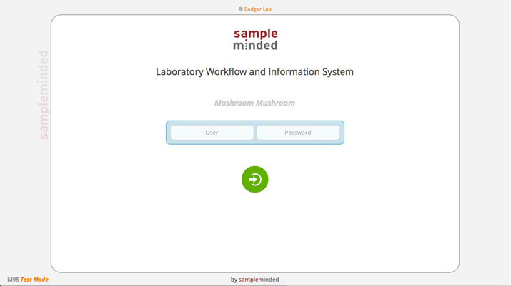
Login:

Our login screen is simple and distraction-free, providing information about the software version, lab location, and creator.
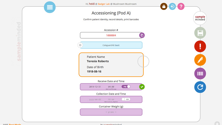
Accessioning:

This screen is where users will scan in barcodes from samples to get them going in the system. An app navigation menu drops down from the blue circle in the upper left, and lock screen, log out, and help icons are in the upper right. Buttons along the right side allow for saving, reporting problems, commenting, printing barcodes, and refreshing the screen. Each has available, hover, and disabled states. Indicators along the right side of each center item allows users to quickly see whether an entered value is valid, invalid, or in a warning state. The center item buttons have dropdowns to show comments, problems, and other information.
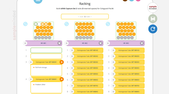
Racking:

Racking is where the user will place aliquoted samples into racks for testing, storage, or other processes. The screen can show up to three racks in both a visual representation of the rack and a numbered list of individual tubes underneath. The racks and individual tubes can be color-coded, and grey spots indicate where space needs to be reserved for control tubes. Each tube can show warnings, problems, and comments in both the visual and numerical representations.
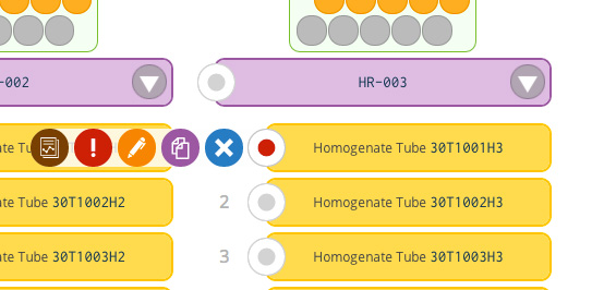
Slider Menus:

Slider menus allow users to do actions on each item. The slider menu in this screenshot shows that users are able to view reports, report problems, make comments, copy tube names/numbers, or remove the individual tube from the current rack.
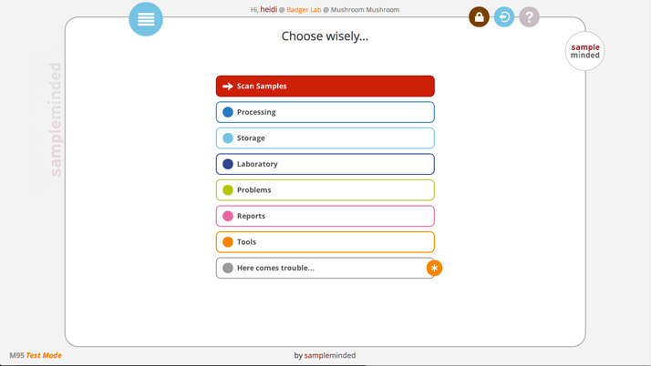
Navigation:

The navigation menu is a simple nested drop down using a customisable palette of the eleven system colors. Main categories are indicated by a white background with a colored dot and border.
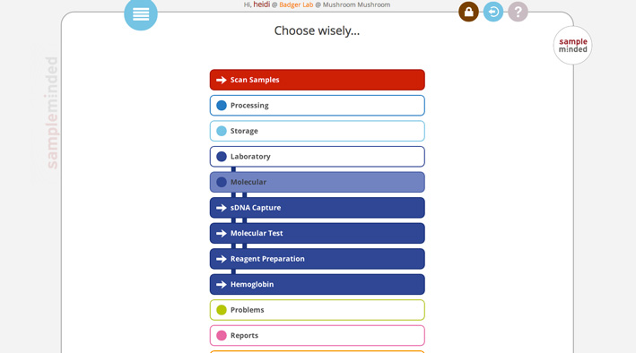
Navigation with one sublevel open:

Each category opens into either submenu buttons or actionable button links. The buttons that will take you to a different part of the app are indicated by an arrow icon and a base color background. A submenu is a lighter variation of the main base color.
Navigation with two sublevels open:

As each sublevel menu is opened, vertical stripes in the background indicate which category the final link button is a part of.
Navigation with three sublevels open:

The app allows for four levels of nesting, each with a different color variation and stripe pattern.